Google Keen beta test and walkthrough
Takeaway
Keen is a new product from Google intended to keep track of your interests, though I’m unsure if it’s meant to be more social or more idea focused
Keen walkthrough
I was invited to try a beta of Keen, a new product from Area 120, Google’s workshop for experimental products [1]. Keen is meant to “help you expand your interests”, by “staying keen on your interests, getting recommendations, and curating good ideas”. Like my prior posts on Hoppin or Cosign, let’s take a closer look at the product.
Signup and user flow
The signup process is straightforward if you have a Google account and are already logged in on your browser. I didn’t see an option for people without Google accounts, and assume that’ll change once they’re out of Beta.
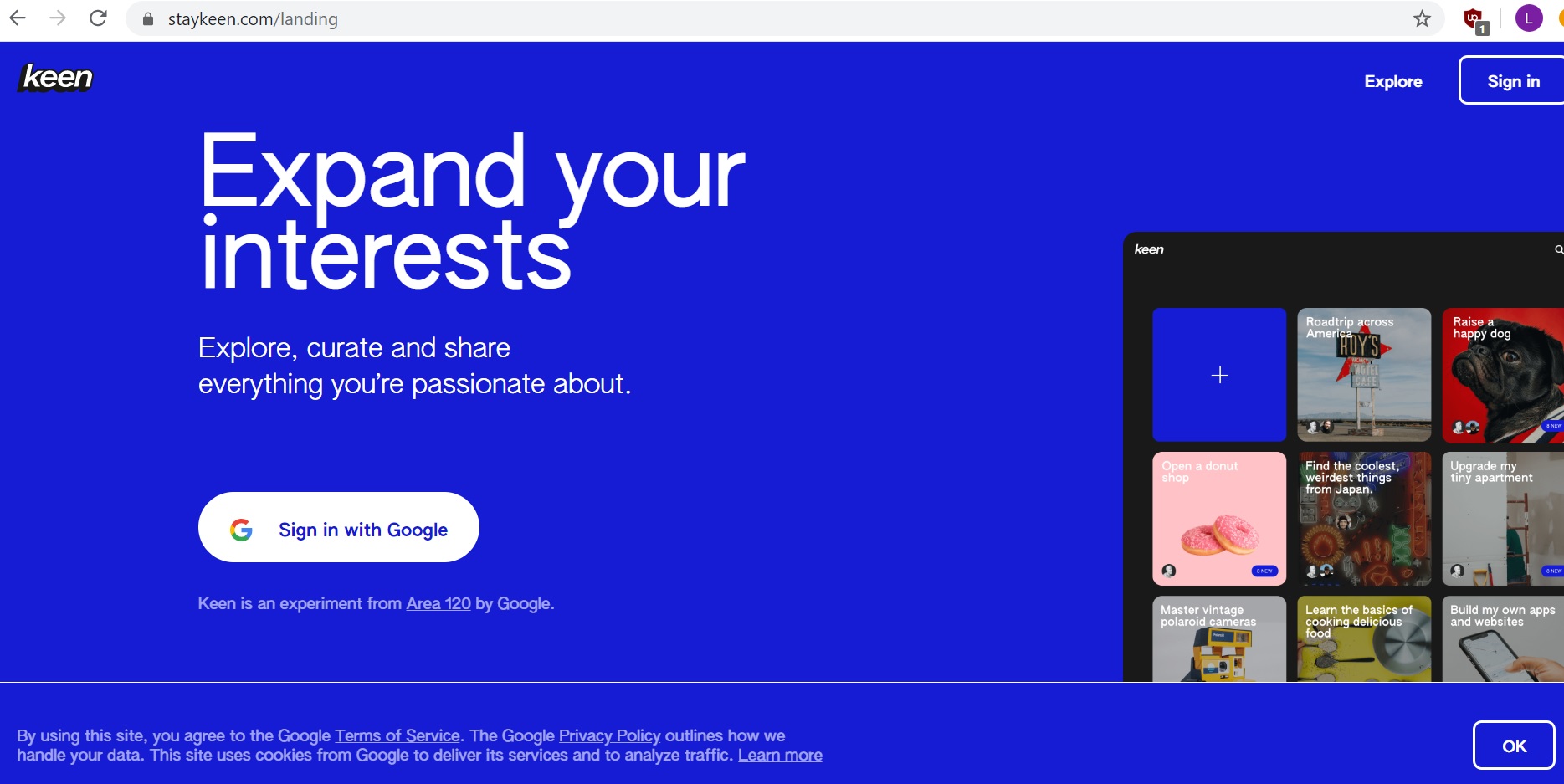
After you’re signed up, the first view is that of a tiled screen, with a large plus sign to the left. The other tiles seem to be of various topics that I might be interested in checking out. If there was ever an argument that Google isn’t spying on you and your data, this could be it, since none of the initial suggestions were close to my interests. Perhaps they pre-populate it based on what the average American might be interested in?
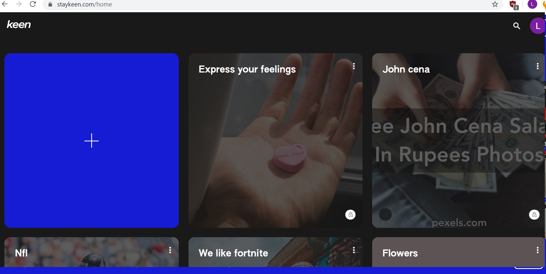
It was unclear what I was supposed to be doing first between the plus sign and the other cards, so I clicked on the plus sign.
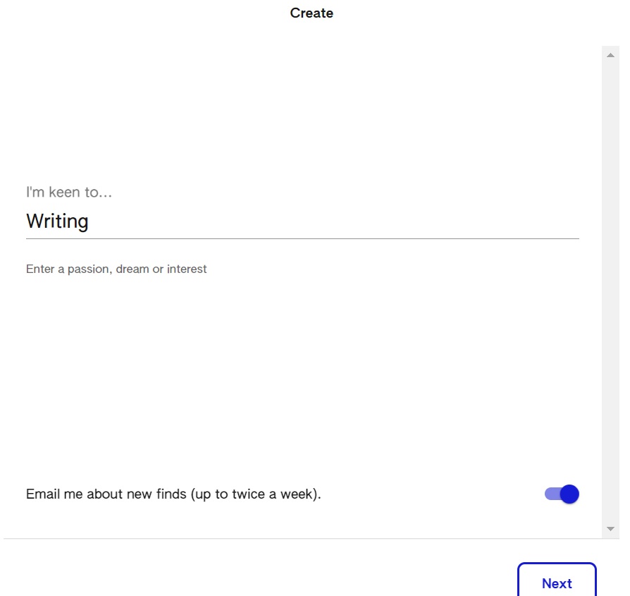
This brought me to a “create” option, where I could type in what I was keen to do. Hence the name, I’d imagine. Being always on the lookout for more opportunities to shill my newsletter [2], I put in “Writing”.
There was also an option at the bottom to “email me about new finds”. I’d normally not want more emails, even for a new service, but I left the box checked since I wanted to see what the email suggestions would be like. As of writing this I haven’t received an email yet; I’ll update the post if there’s anything significant to highlight.
The next step gave a text box to “list searches or questions you want results for.” I was unsure whether putting as many searches as possible was better than just having one phrase, so I only put in one search query. I assumed that this would give me more targeted results compared to putting a long list of phrases, but can’t confirm it.
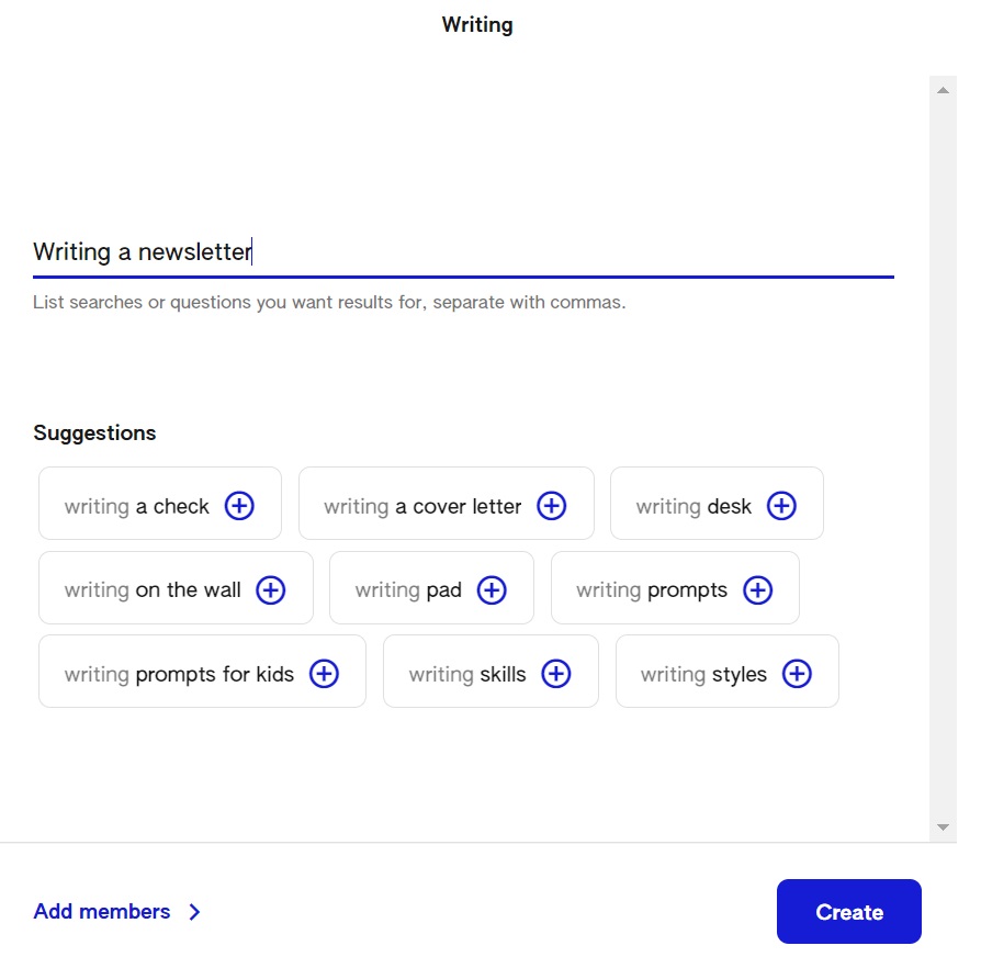
I could also add members to this list (a Keen?). Members would be able to add gems to the keen. Since I have no friends I left that untouched, just like most of us in quarantine.
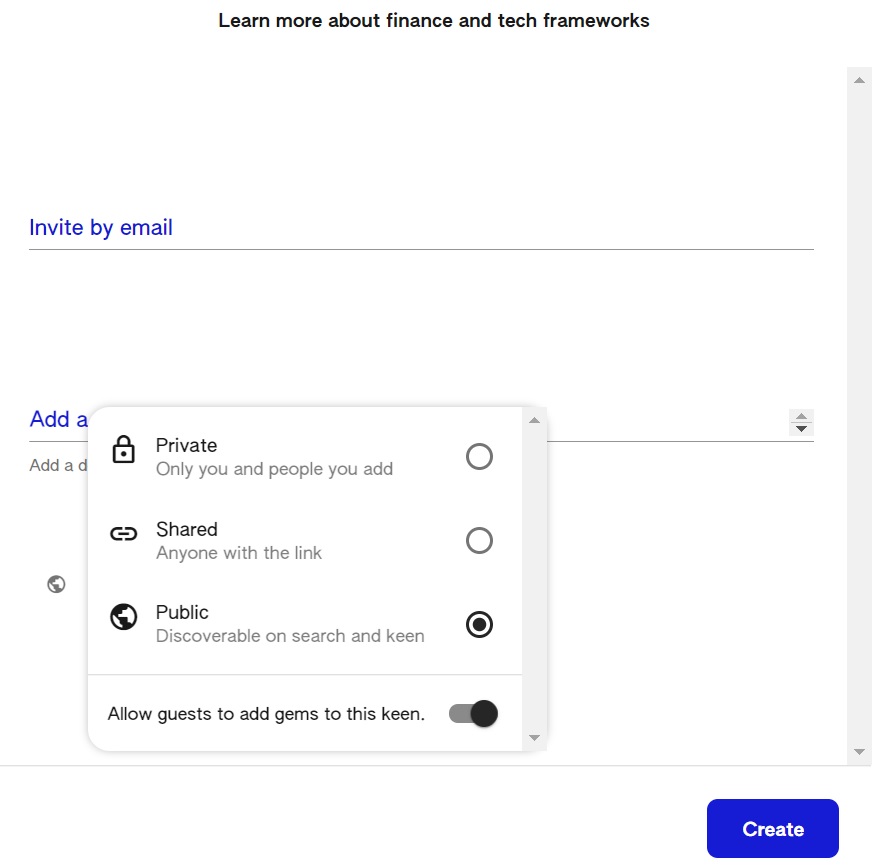
That was the last step in creating this tile/card/keen [3]. I ended up on a screen that reminded me a bit of Pinterest. There were 3 items on the navigation menu, “feed,” “gems,” and “following”. Below that was the page and items for whatever I’d chosen on the menu. In the screenshot below you can see I’m still on “feed.”
The site now prompted me to add a gem to my collection, and to also gem what I loved. So we saw multiple collections on the initial home page, and can create a collection ourselves. Within a collection there’s another page that shows multiple gems, and we can create gems as well.
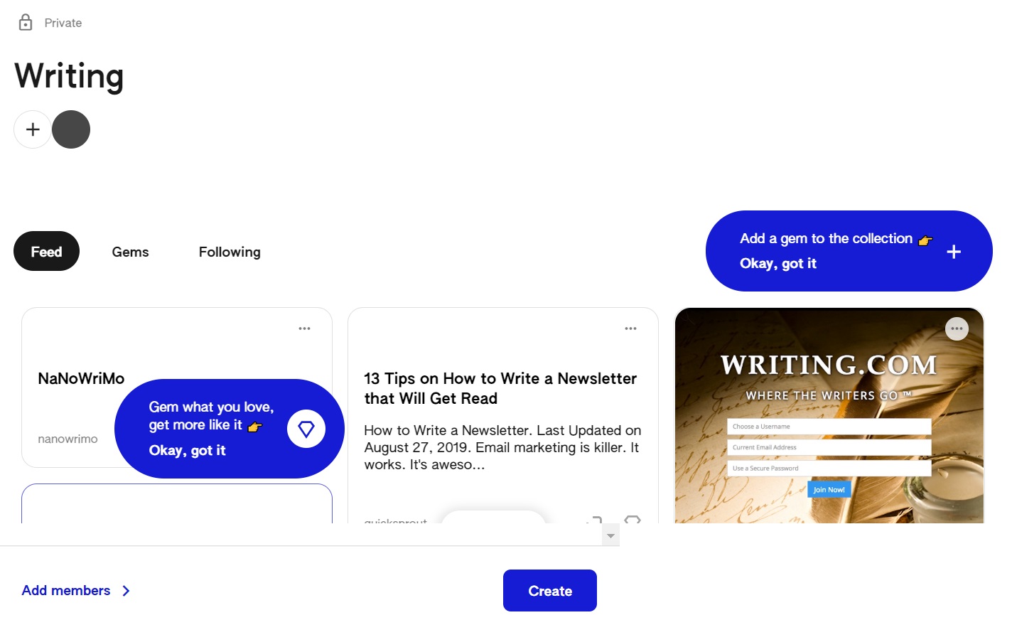
Let’s create a gem then. I clicked that plus sign again, and a popup appeared, prompting me to “add something new.” I was lost at this point, since the UI looks like a single line, and was wondering if I should be adding a link, an image, a body of text, or something else. If you type a lot of text, it does start scrolling down, but without a visual scroll bar on the right. I’d assume that’s for design purposes. The text box maxes out at 4 lines before it scrolls down, whether on mobile or desktop, which I assume is to leave enough white space below for the post preview.
I ended up looking at other people’s collections before coming back to this, which doesn’t seem like a great user flow. Based on what other people were doing, I put in a title, an article link, and then a bunch of hashtags [4]. I tried putting in line breaks but those didn’t seem to show up when the gem was published.
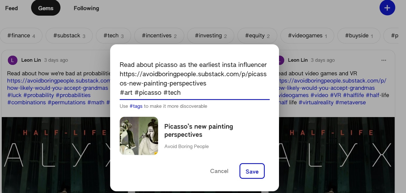
The popup does show a preview of the link after a slight delay. You can’t edit that preview, and it also doesn’t go away if you delete all the text in the box, unless you start typing in more text.
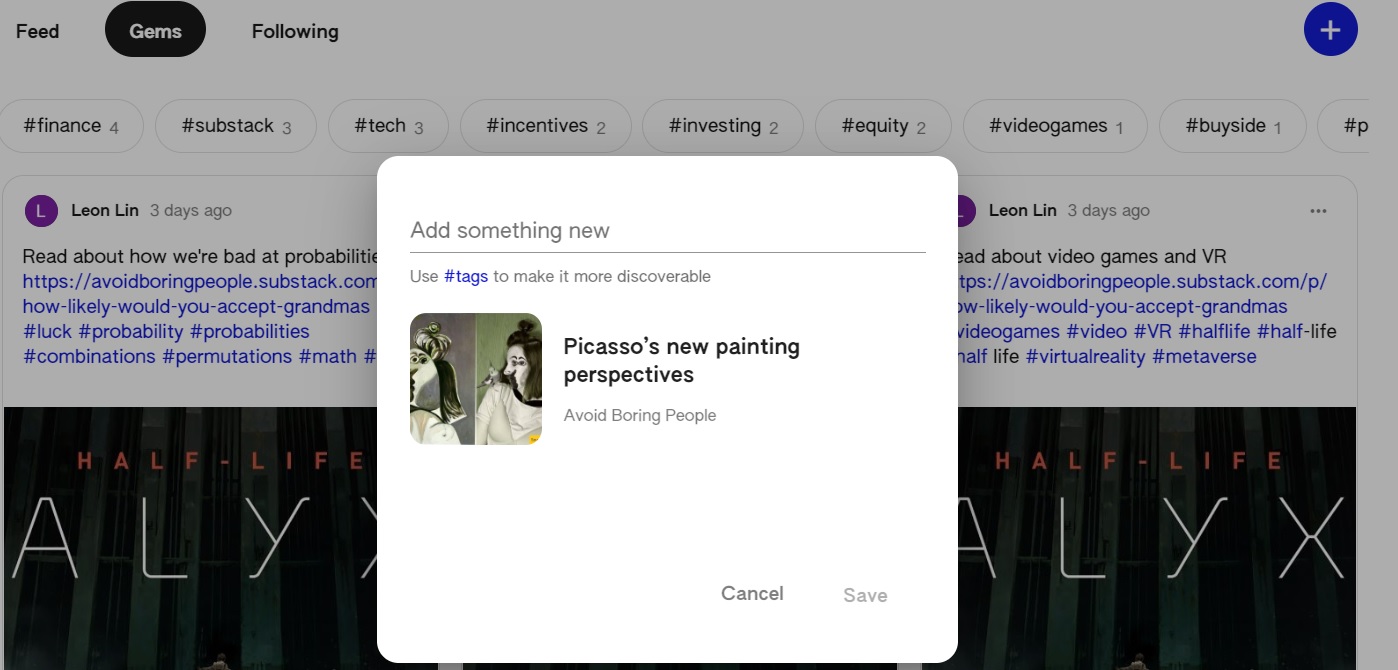
After clicking save, my gem was created, and I could find it by clicking on the “gems” option in the navigation menu, which I assume shows all the gems that I’ve created. This would be in comparison to “feed”, which would be gems that Keen thinks I should check out. The “following” option gives me the option to add more searches or questions to this collection.
That’s the flow from signup to the collection creation step done, so let’s also look at how browsing works.
Browsing other collections
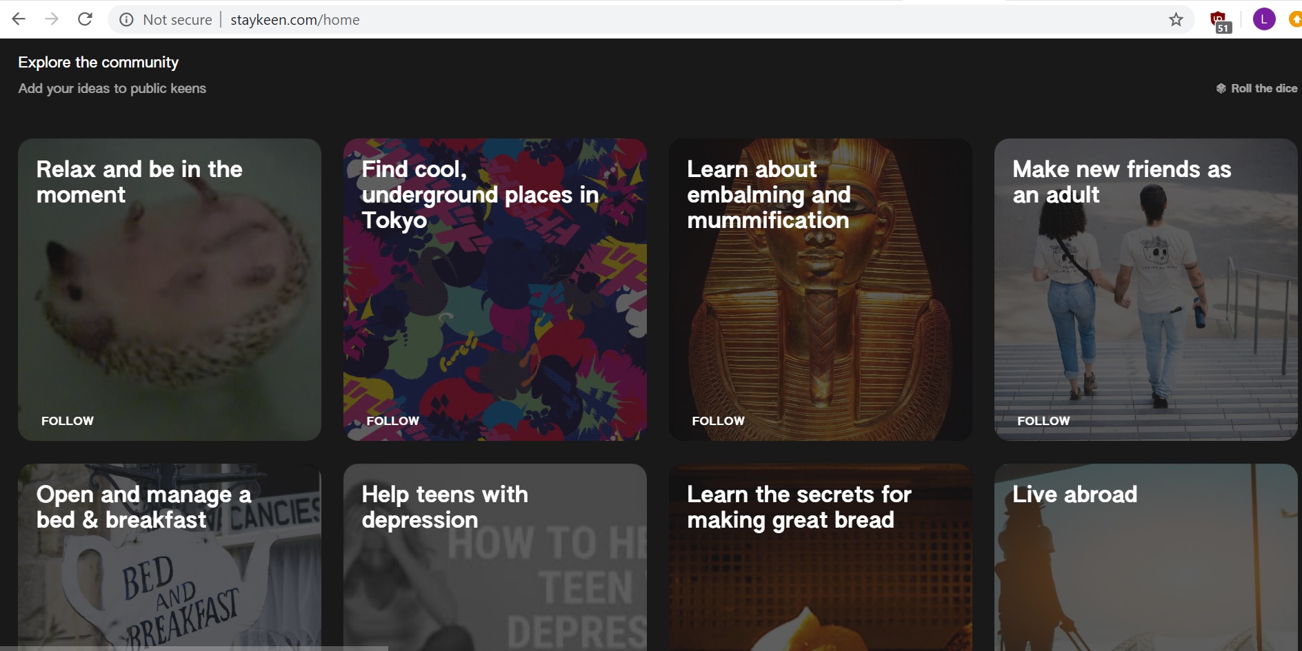
To browse gems and collections that are not your own, you have to go back to the home page. From there, you can scroll down to “explore the community” and “add your ideas to public keens.” It seems like Keen gives you a random list of cards, and you can roll the dice in the top right corner to refresh the list. At first, I found it strange that you can’t search for a phrase and have to leave it to chance, but then realised there actually is a search button when you scroll back up all the way to the top.
It seemed like there were limited public collections for me to browse through, since I kept getting repeats. However, I never saw my own public collection in the list suggested, so perhaps that assumption is wrong. After rolling a few times and getting results such as “how to pose for pictures (for girls)” and “plan a baby shower” I gave up on finding anything relevant to finance or tech, and clicked into a public collection titled “stay productive.”
The collection showed gems from a group of other contributors, who had uploaded a mix of youtube links and websites. Each gem card gives you the option to share, comment, or open. Clicking on the top of the cards doesn’t do anything, but clicking on some parts of the bottom picture or title will open the link attached.
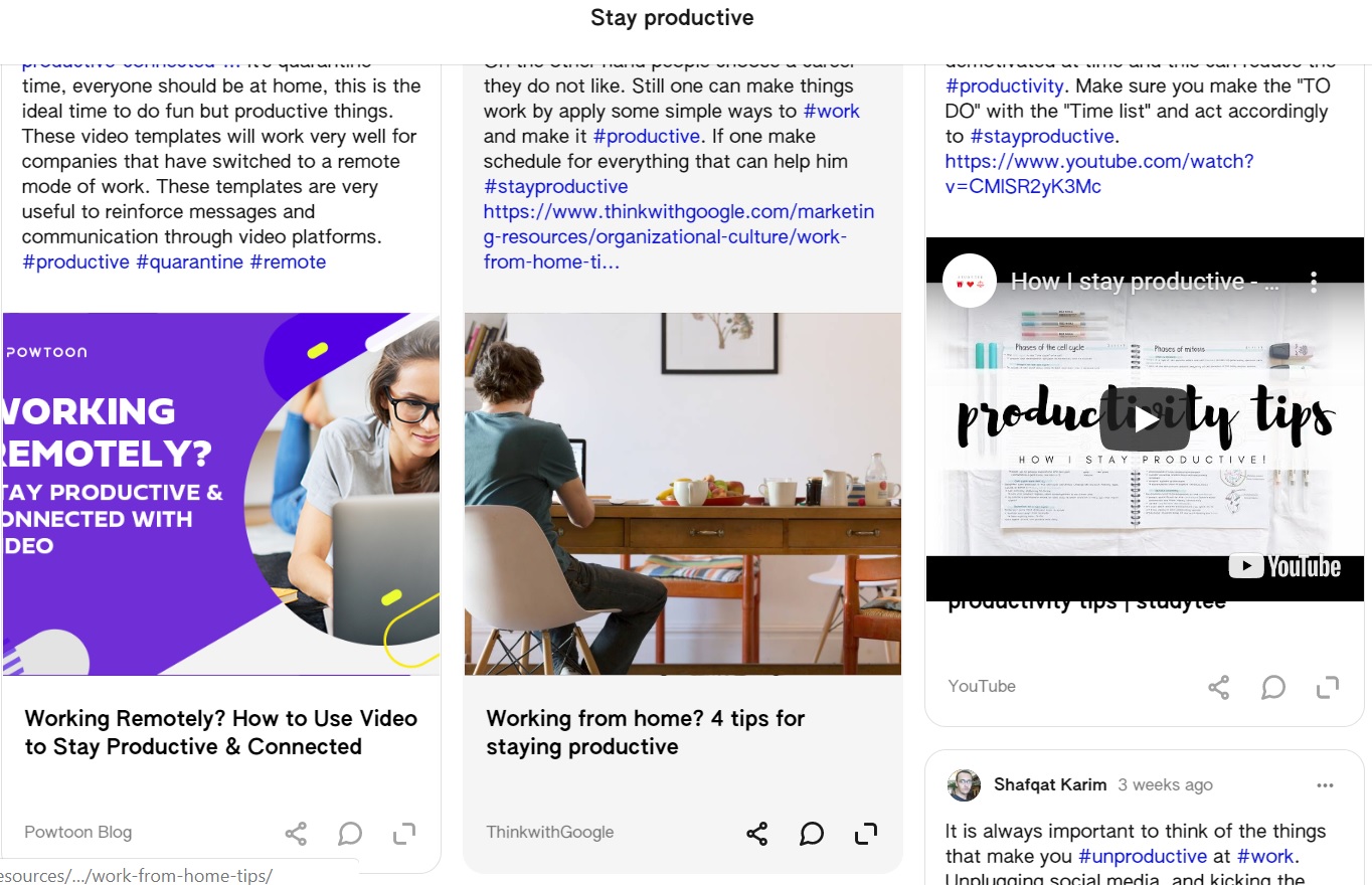
Sharing brought up a link to copy or send via email or whatsapp.
Opening brought me to a new page, with an enlarged version of the card, but it wasn’t that different from seeing the card in the collection. Importantly, this still doesn’t open the entire article linked, and it’s an additional step to click through to the link, which opens up another tab. In other words, the gem just gives a small preview, the open function doesn’t seem to do much additional work at the moment, and you’ll have to bounce off Keen’s site to read the actual article.
Commenting brought me to the same page that opening does, except anchored to the bottom of the card for me to type in a comment. I posted a comment on a card just to test the functionality. You can edit or delete comments after you’ve posted them.

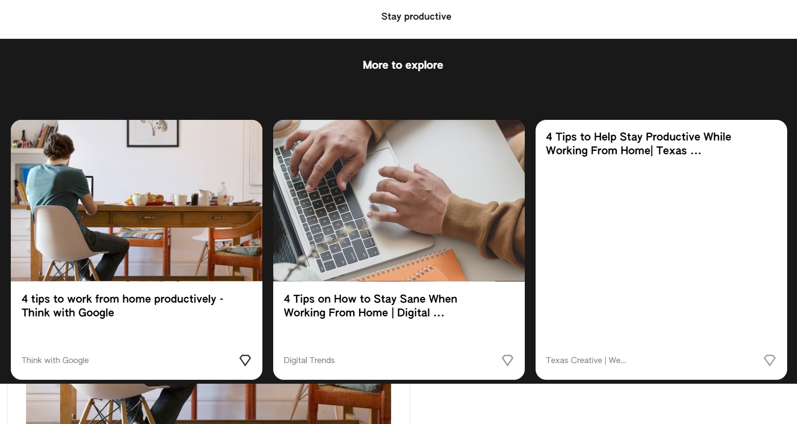
After opening the card, there’s a space below where Keen highlights “more to explore.” These looked like gems from the same collection, though I couldn’t be sure. I couldn’t “open” these gems, and clicking on them brings me directly to the link, rather than the page that you get brough to when “opening” a gem.
That’s it in terms of browsing. If you want to go back and explore other collections from the opened gem page, you can’t go back directly, as the Keen logo normally on the top left isn’t there, having been replaced by an arrow that brings you back to the collection of gems. From there you can click back to the home page and continue rolling the dice for more collections.
Thoughts on Keen
Having played around with Keen, below are some initial thoughts, keeping in mind this is still in beta and more of an experiment:
-
Who is the intended content creator on Keen? When I add collections and gems, am I supposed to just be spamming links, since there’s no space to create my own content on Keen itself? If we assume this becomes a scaled product, what’s the incentive for a content creator to continue posting links?
I’m assuming it’s for follower counts, since there aren’t like or view counts. So it seems like this would be another Pinterest, except for ideas. As a content creator myself I’m open to adding my content to more sites for reach, as long as I believe the return in views is worth the time investment. Keen’s size probably isn’t there yet, but could be in a bull case.
However, given that all the links will direct me off Keen, I’d rather build that relationship with the user directly, e.g. I’d rather have you read my newsletter via email than browse it on Keen. This implies that I don’t have incentive to keep you on Keen once you’re following me outside of it, and might even be disincentivised, since you’ll find other content that’s not mine.
-
Who is the intended content consumer on Keen?
The random collection feature is a bit more like Tik Tok, Stumble Upon, or Instagram. It doesn’t seem to be related to either my own Google search history or the collections and gems I’ve already uploaded. Is the average user someone who is bored and looking for entertainment then? At scale, I suppose there would be enough interesting categories for people to explore every time they roll the dice. It does seem like a small group of people that would be looking for “content unrelated to what I like but randomly adjacent enough to be interesting.”
Keen is meant to help me “stay keen on your interests, get recommendations, and curate good ideas.” I suppose if I created collections of just the things I was interested in, and relied on the feed within those collections to return random search results, I might occasionally find a relevant link. Since I don’t know how those results are ranked and returned, I’m uncertain if they’ll be worth my time to browse, especially since they will bounce me off Keen’s page every time.
There’s a comment feature in Keen, but other social features seem lacking, and I wasn’t able to click into user profiles. Makes me think that the use case is for ideas rather than a social product.
-
How is this going to be monetised?
With Google, perhaps never. If it does monetise though I’d assume it would come in the form of display ads, perhaps in the form of sponsored collections or sponsored gems.
-
How will this grow and acquire creators and consumers?
There’s low incentive for creators to promote Keen, since they’d rather promote their content directly if given the option. e.g. if I posted on twitter, I’d rather direct you to my personal site than to Keen.
Consumers could be interested in promoting Keen as a new way of discovering content, assuming that there’s enough quality content to browse through. Perhaps some of those become creators.
That implies that the gating factor to growth is going to be the acquisition of enough creators on the platform, before there is enough scale on consumers to make it worthwhile. If I were Google, I’d be targeting content creators on other sites and giving them perks for posting on Keen [5]. And if they had a feature to highlight a leaderboard of creators by follows, collections, or gems, and then rewarding the top creators, that could also be interesting.
-
How will costs grow?
I’d assume the plan is to have a flywheel of users attracting creators attracting users in the long term, so that customer acquisition costs are low. In the short term, there’s the fixed costs of employees working on this, and what could be a high variable cost in acquiring new creators and users via ads and social outreach.
-
Why is there no home page feed of all my collections and gems?
Seems like the intent was to have a separate feed for each interest, which becomes annoying once you get to scale. I can’t customise how my collections or gems look either.
-
Why can’t I add a gem without adding it to a Keen?
Put another way, can’t I just create gems rather than having to set up a Keen to house them? If I had 10 different interests, would I need to find 10 Keens to add my gems to? Considering I’m tagging the gems as well, seems convoluted.
Overall, Keen reminds me of a more visual, snappy version of Pinterest blended with Stumbleupon. I’m still unsure what the use case is and how they’ll grow the product given the current incentive alignment, but we’ll see in time. Like most social products, it’s hard to predict success from a beta.
Footnotes
- Not as exclusive as it sounds, I was just in a slack group with a person who was handing them out. Full disclosure, there was talk about giving gift cards to beta testers.
- Did you know I write things like this regularly at Avoid Boring People?
- I could be mistaken, but think that the phrase “keen” hadn’t been surfaced in the product at this point yet unless you click to add members
- The screenshot below was taken after I’d already created a few gems; my first attempts at doing so gave errors in the process due to what I believe was an account sign in issue where I was using an admin or someone else’s account
- Or running beta tests and sending out links to those. Hmmm.
If you liked this, sign up for my finance and tech newsletter: